R E F R E S H I N G A N E S T A B L I S H E D B R A N D
This 25 year old company needed a fresh look that would help it stand apart
from the competition and highlight their new digital offerings.
This 25 year old company needed a fresh look that would help it stand apart
from the competition and highlight their new digital offerings.
|
OSG Gets a new iconic look
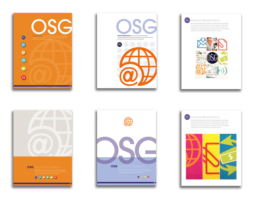
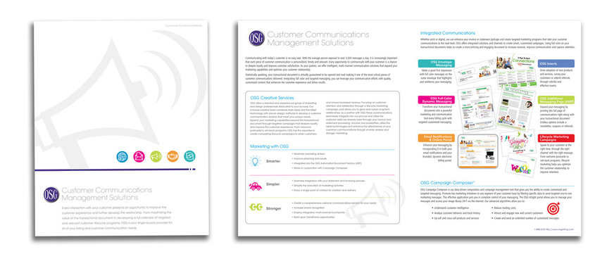
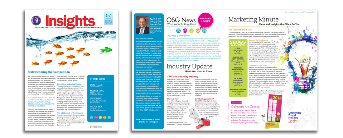
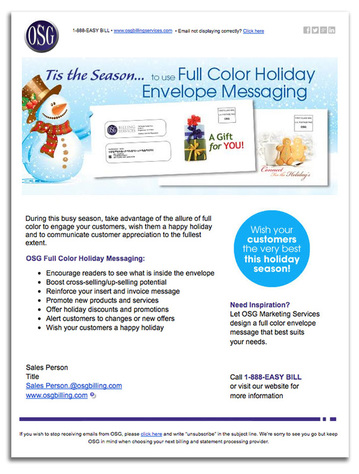
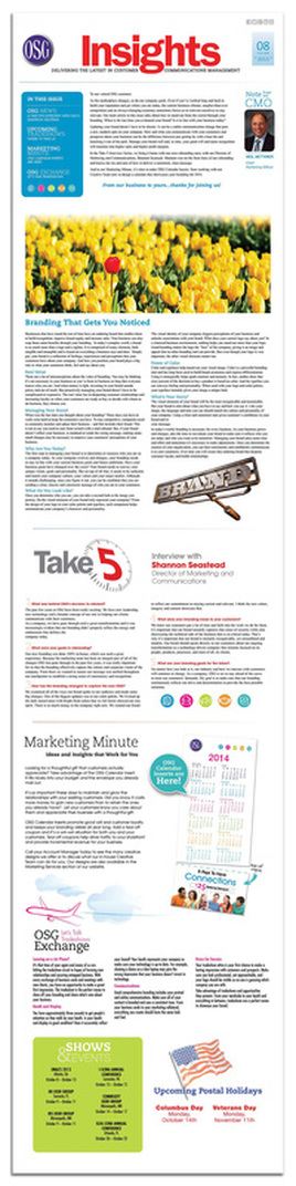
Strategic Challenge: This established billing services company wanted to refresh their decades old messaging and branding, to attract new business with their new digital offerings. Requirements: To keep the existing Avant Garde font, the circular OSG logo and the purple divider rule, the company believed were established and recognizable brand elements. Execution: The previous branding had dark hues and heavy ink coverage (think 1980's). I wanted to lighten and brighten things up since the company was entering the digital space. I started with a vibrant color palette and Iconic symbols to represent the major divisions and the services within. The circular icons play well with the required OSG logo. |

|
Some of the design options explored.
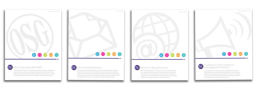
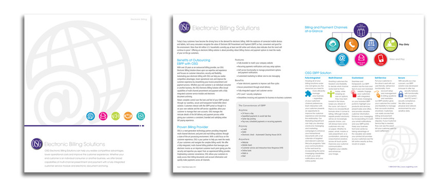
The final graphic standard selection was carried across the entire enterprise.
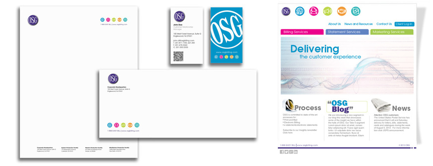
Sales brochures
Redesign of the newsletter
|
New email template for promotions
|
Digital version of the newsletter sent out in email
|